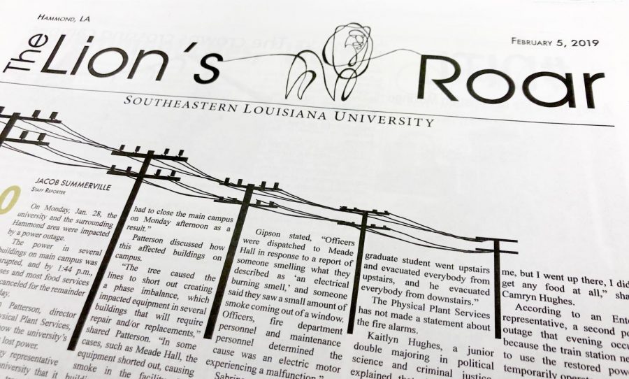
Editorial: Why a new look for the newspaper
Annie Goodman/The Lion’s Roar
In addition to the new masthead, there are some other changes within the newspaper to take note of.
You may have noticed some differences in the recent issues of The Lion’s Roar. The first major change was to our back-to-school issue. While we have been doing a magazine format special edition since 2013, this was our first time having it printed on actual magazine paper. Next, we unveiled a new masthead in our first regular issue of the semester last week. This revamped front page has inspired us to update the look of the interior pages as well.
At The Lion’s Roar, we always strive to provide our readers with timely information and features. Since the standing elements within the paper gave it a very traditional look, I felt it necessary to update them with a more modern look and feel to better reflect the direction I hope to take our publication.
A few of the more notable changes are the new look of Speak Out on page three and the Sports section becoming Sports & Fitness. Personally, I have never been a fan of the look of the previous Speak Out, so I am quite content with the update. I have opted to expand Sports to Sports & Fitness because I feel that Sports is a very niche area, and I would like to further the reach and relatability of our publication. By including fitness with our sports features, I hope to expose our readers to more subject areas as well as draw more traction to our sports section.
I know that change can be scary, but I believe this is a needed change. As one of the oldest forms of mass communication, I understand the appeal of a traditional look. However, as a college newspaper, I would like to find a way to better appeal to the average college-aged student. I believe our new look brings with it a refreshing feel that can hopefully catch the attention of more students on campus.
In my first editorial, I called The Lion’s Roar a little monster – comparing it to Dr. Frankenstein’s method of piecing things together from separate entities into a new life. Our revamped image is the stitching used to tie our parts together. Last semester, our publication encountered tribulation after tribulation, and many faults shined through the cracks. With better planning, I hope we will be able to provide a higher quality newspaper this semester, and our new look is the fuel being used to propel us in the right direction. It will guide our decision making and creative pursuits.
To all of our current readers, I hope our changes are not too off-putting for you. If you are taken aback by some of these changes, I ask that you stick with us and give it a try. If you have serious concerns or issues, please reach out to us before turning away. Without you all, we would not still be here today.
To any new readers, this whole editorial may have seemed useless since you are not well acquainted with our previous look. Thanks for reading this far anyway, and I hope you like what you see and choose to stick around for a while. With any luck, you will not be reading another one of these any time soon. You should also check out our website lionsroarnews.com and our Instagram, Facebook and Twitter @lionsroarnews. We are in the process of updating the look of these as well in the same fashion.
Either way, thank you for reading our publication. We will continue to work hard to bring you interesting features and provide timely information important to the university’s campus. We exist to inform our readers about relevant things going on, good, bad or otherwise interesting, so if you know of anything happening that you would like to shed some more light on, please contact us at any of the methods listed at the bottom of this page.

Your donation will support The Lion's Roar student journalists at Southeastern Louisiana University.
In addition, your contribution will allow us to cover our annual website hosting costs.
No gift is too small.


David Lloyd • Feb 5, 2019 at 1:36 pm
I like the new look!
ROAR!